This is one of my favourite pieces and was commissioned by a friend and musician, Adriesca, to be used as cover art for one of her upcoming releases.
The brief was quite simple and broad and asked of me to recreate an image in her likeness from a recent photoshoot, but in the art style that I had been trying to perfect in my other pieces.
Here, I still attempted to learn something new by utilising post-processing after completing the drawing. This involved playing with the colour values, hues, saturations etc, along with the curves to achieve the correct amount of brightness and "pop".
The process I followed is outlined below.
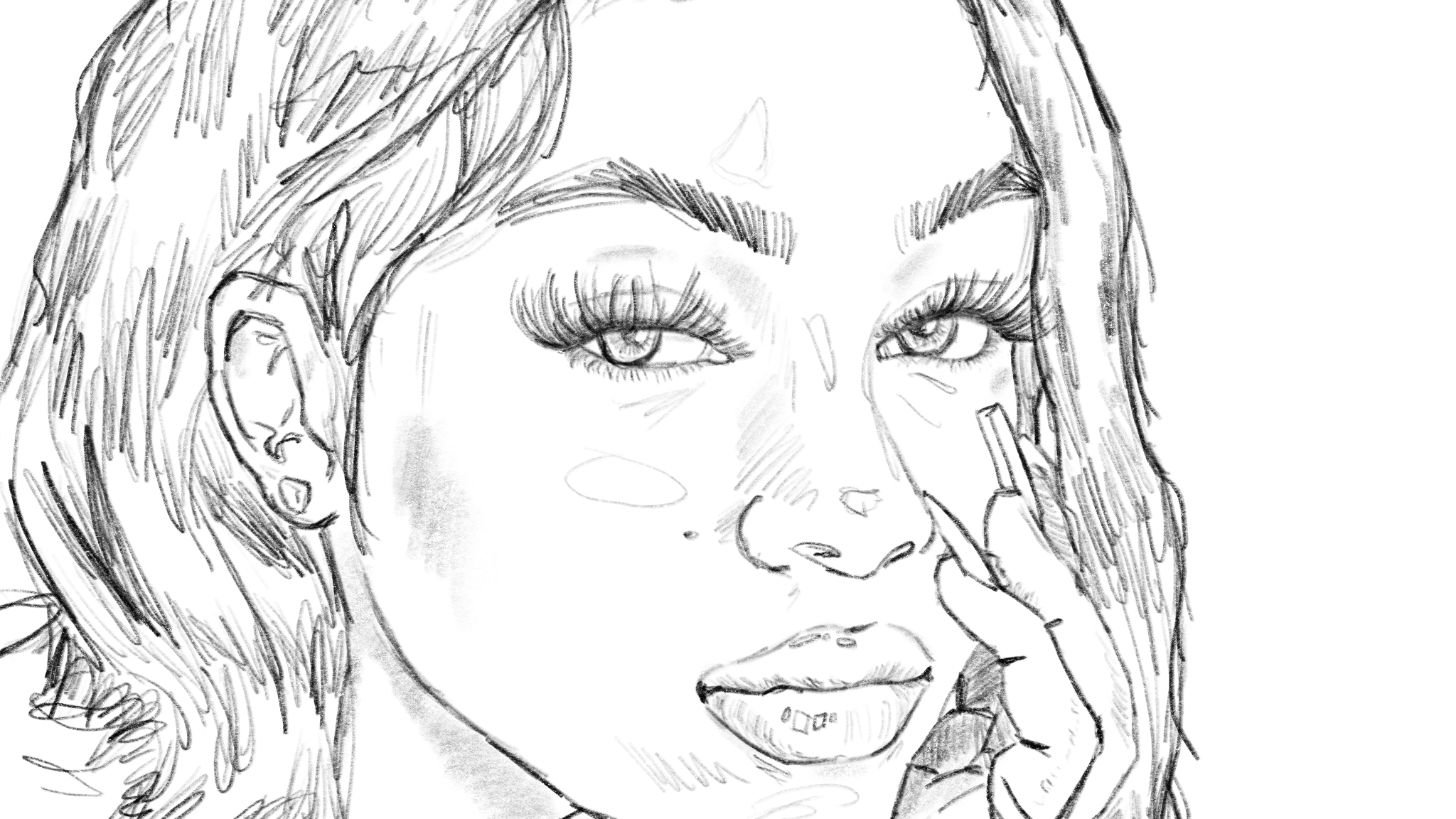
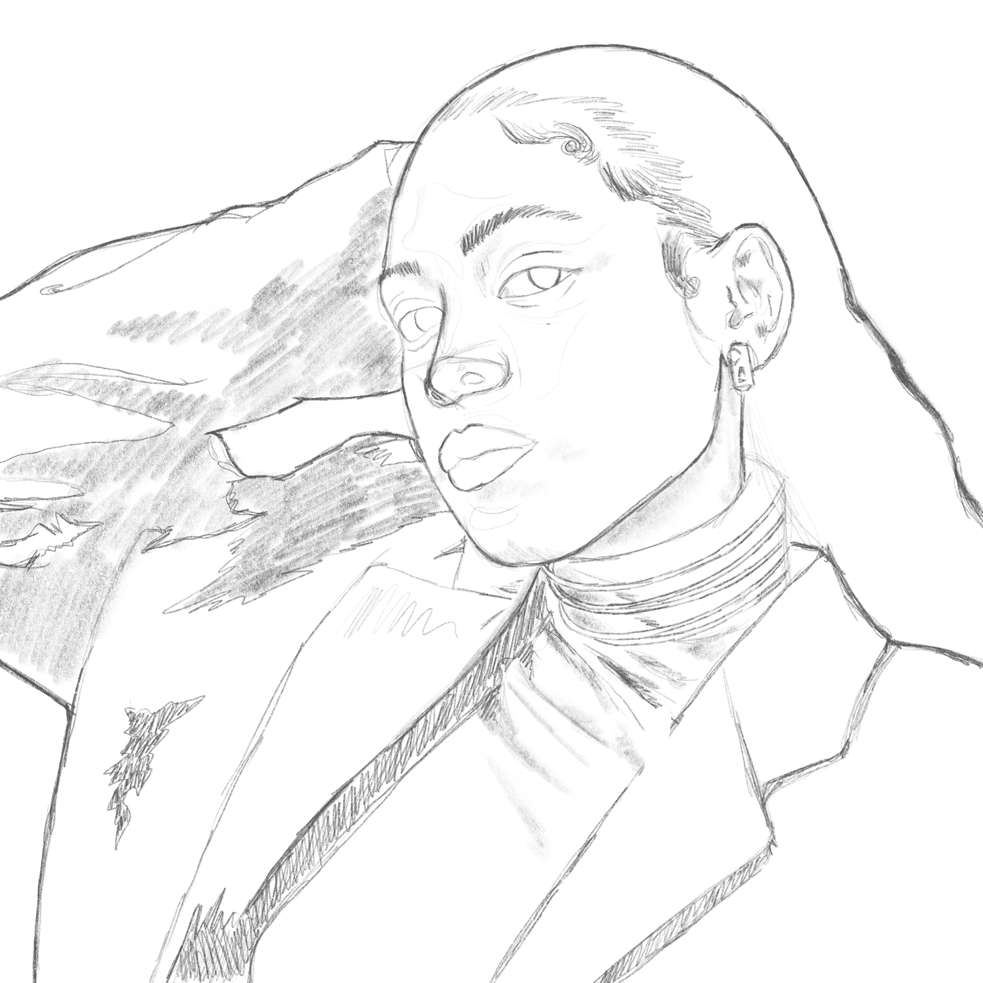
Pencils.
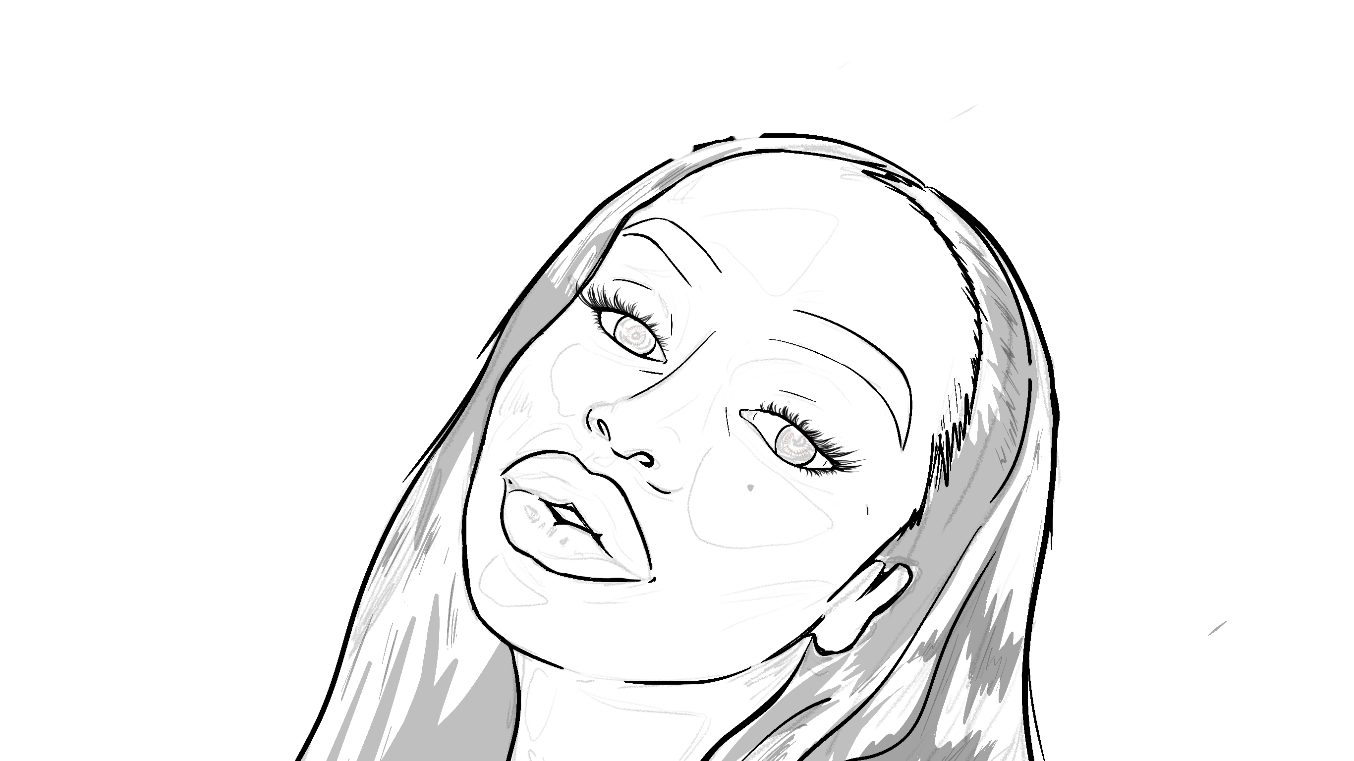
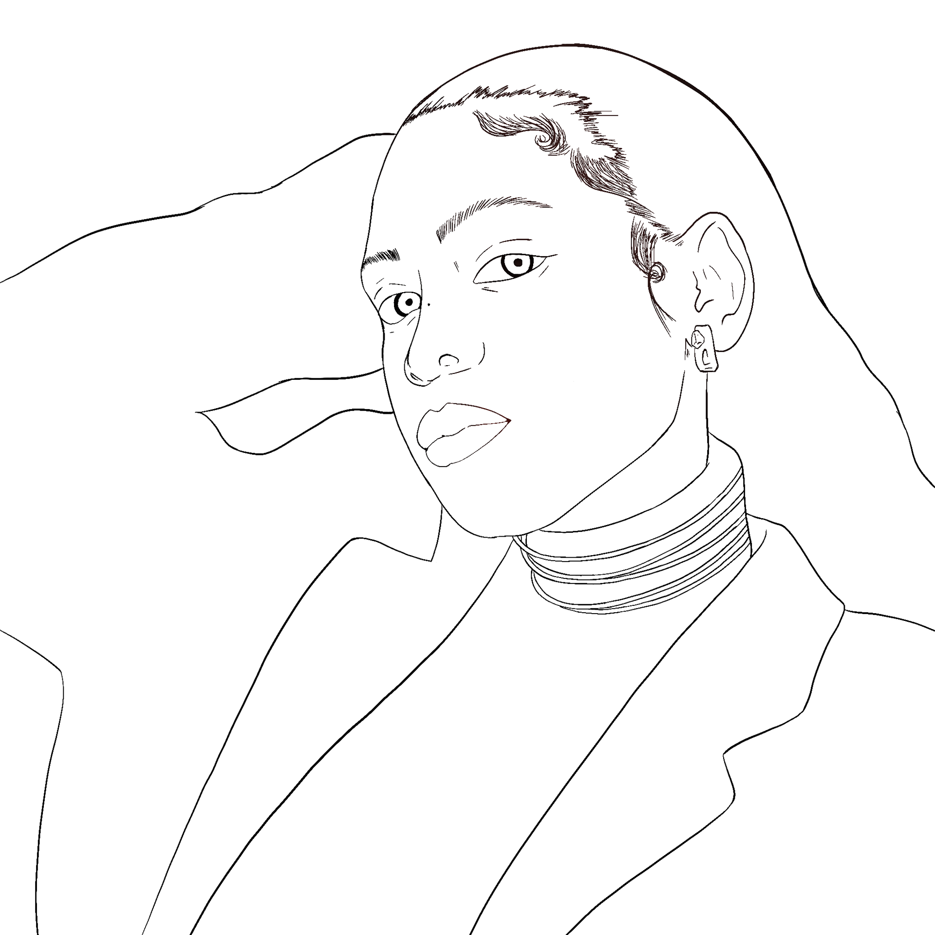
Inks.
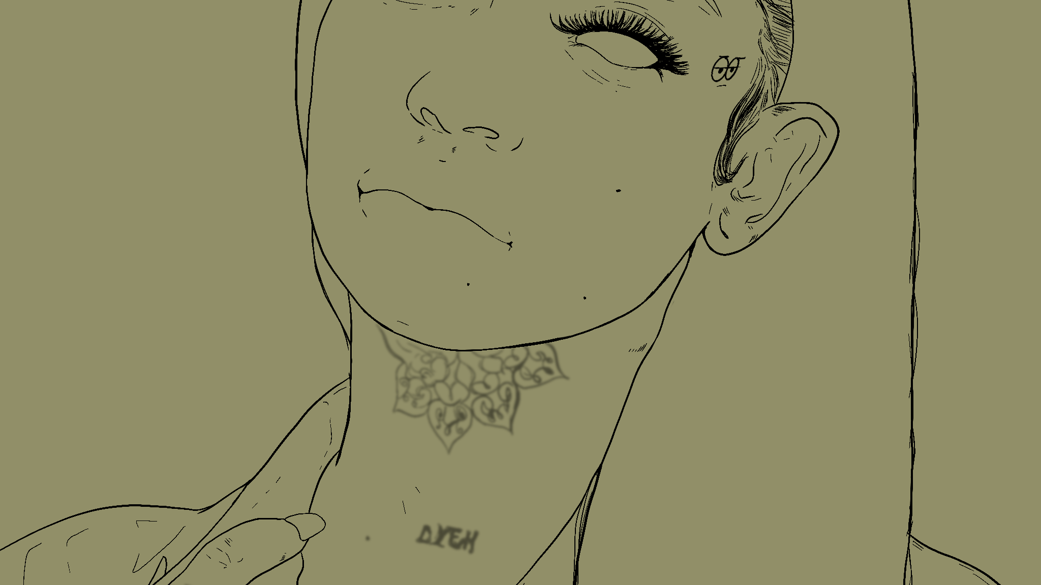
A new habit of mine is to capture as much detail as I can from the reference image in the pencils stage and then use that as my new reference point going forward. It enables me to work with less references overall and helps to prevent me from being too much of a perfectionist. I essentially employ an "error carried forward" approach. This then allows me to create a very clean ink sketch to house the colours and then occasionally view the pencils again for clarity.
At the end of the day, art isn't meant to be a replica but an interpretation of the source.
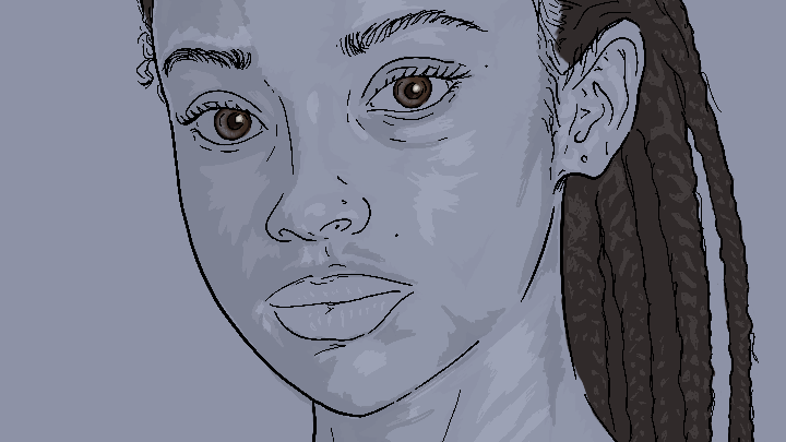
Colour exploration.
Here, I explored the things that Procreate could do post-processing. I played with the colour curves, saturation, and played with effects. This outcome is more in line with the style I initially wanted to emulate, which is bright and more in an illustrative style.
That being said, this isn't what the brief was looking for, but by exploring this, I was able to upskill and find a route to perfecting my personal style.
That being said, this isn't what the brief was looking for, but by exploring this, I was able to upskill and find a route to perfecting my personal style.
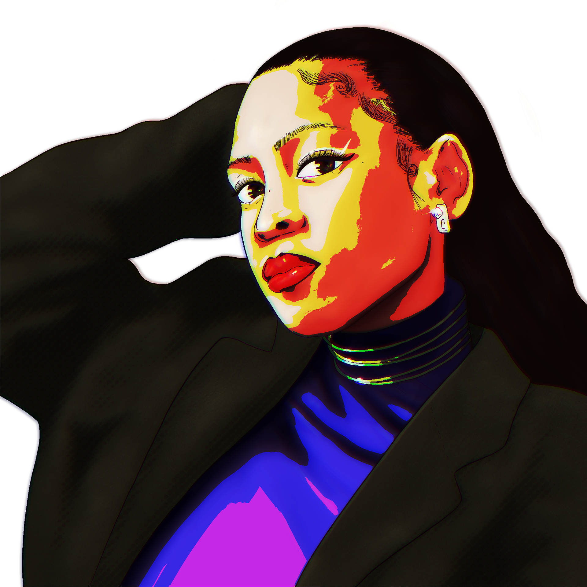
Final submission.
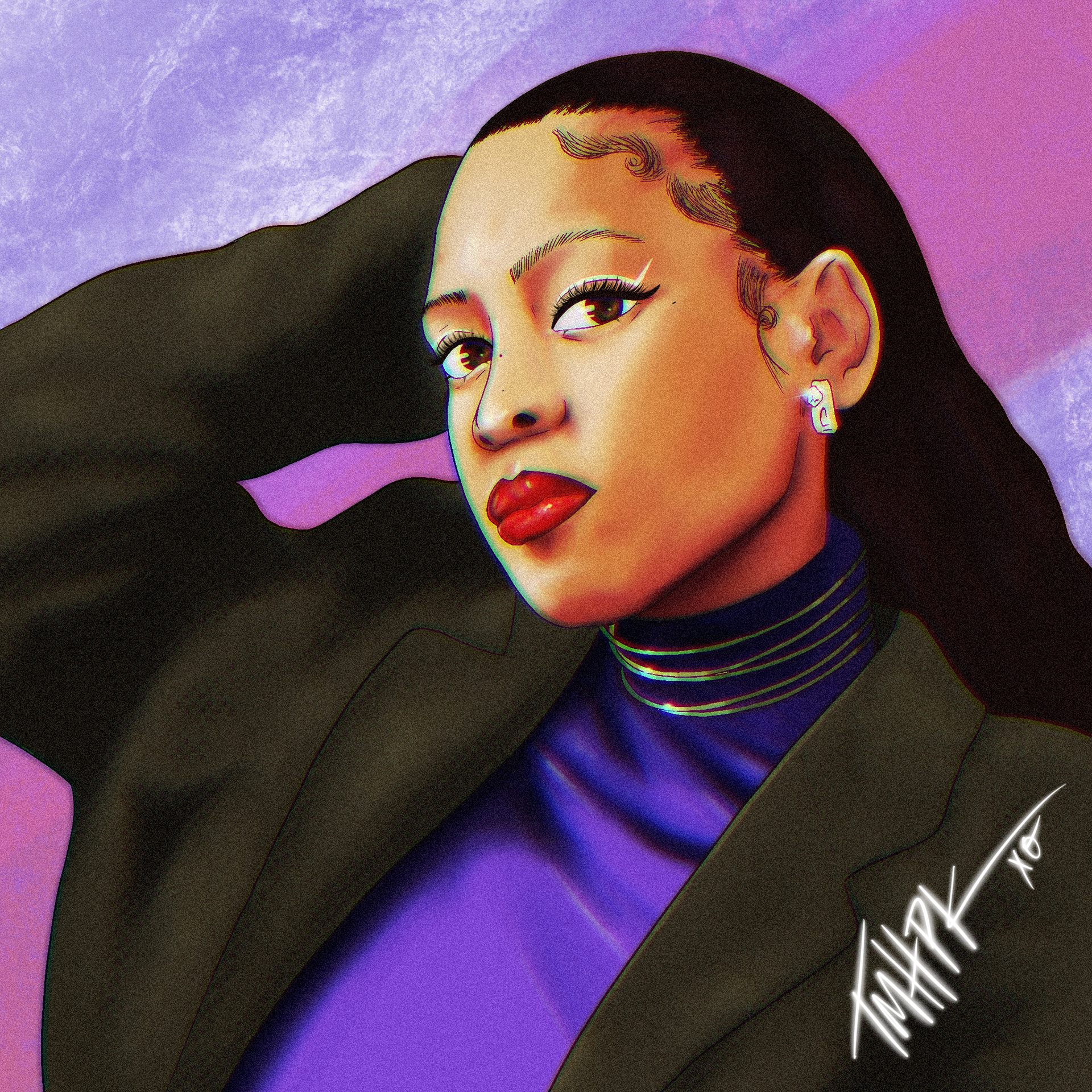
This was the final submission that was loved by Adriesca.
I utilised the grain effect and the glitch effect to add some more texture and depth to the artwork. It also made the colouring of her blazer a lot easier. I also incorporated Japanese dots as part of the shading on her blazer to add more visual intrigue.
The background was used to make the work more colourful and match the themes within the music this piece would be the cover art for. It also allowed for the illustration to stand out better.
Overall, this was a very fun project that allowed me to explore the capabilities within Procreate. It is a very versatile and powerful tool that has been a massive boon in helping me to perfect my craft and establish my visual illustrative style.